Follow these ten steps to turn collected responses into verified charts, a story folder, and a reviewed slide deck.

The analysis flow at a glance

1

1. Create or suggest a plan

Open Analysis → Analysis plan and select Build a plan. Choose the questions and settings yourself, or ask the Plan assistant on the right to draft the plan from your analysis brief or an Excel or Word plan. Review what it proposes, then save and generate the plan.
2

2. Review and save charts

Open the generated plan folder in Charts. In the chart viewer, use the previous/next buttons or the ArrowLeft and ArrowRight keys to move through the charts. Edit each plan chart that supports your story and select Duplicate & save to file it in a folder, or copy it unchanged with Duplicate & edit in its row’s ⋮ menu.
3

3. Generate slides from the folder

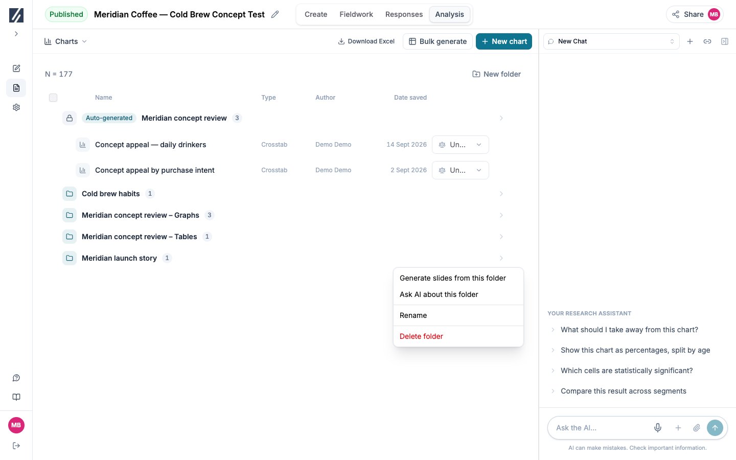
In the Charts list, open your folder’s ⋮ menu and select Generate slides from this folder. Review the proposed storyline, request changes if needed, or approve it to compose the deck.

Before you start

Complete the fieldwork check and quality review, and bring the decisions the analysis must support. Qualifying completed responses must reach 80% of the combined positive panel target before generation; without a positive target, that percentage gate does not apply. You need Editor or Owner access to generate and to build decks.
1

Prepare the plan

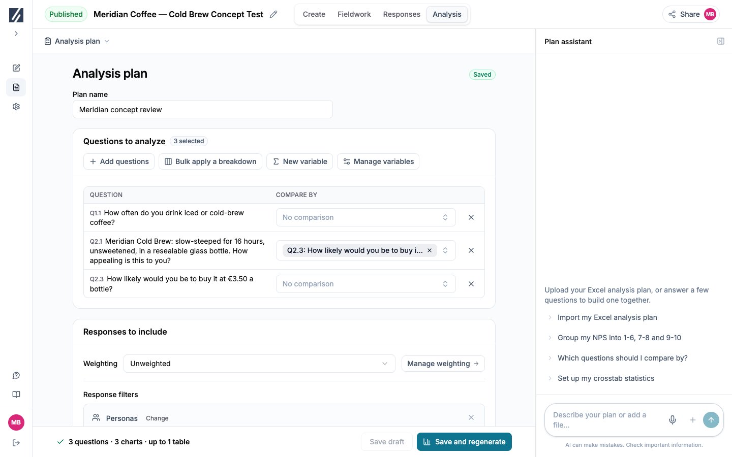
Open Analysis → Analysis plan and select Build a plan. Choose the questions yourself, or ask the Plan assistant to draft the plan from your analysis brief or an Excel or Word plan. For each question, check its comparisons under Compare by. Set Response filters for the population you will report. Under Weighting, open Manage weighting to review a scheme’s targets and diagnostics, then select it, or keep Unweighted. Under Charts and tables, confirm the output language and formats.Check: the footer summarizes the questions, charts, and the maximum number of tables. See Decide when to weight.
Choose questions and comparisons before generating.

Choose questions and comparisons before generating.

2

Save and generate

Select Save and generate, or Save and regenerate when the plan folder already holds charts. Charts opens while the run continues on the server; you can leave the page.The run builds one plan folder named after the plan. For each planned question, in questionnaire order, it holds the totals chart, or one chart per theme for an open-ended question. It then adds a crosstab of the question’s comparisons, keeping only the comparisons in which a column with an unweighted base of 30 or more has a cell significant at 95%. Screening questions get totals only.
Changing the output language archives the current analysis version and its associated chats and slides. Copy or export required work before changing it.
3

Open your charts

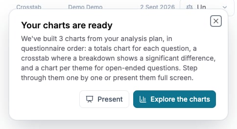
When the run completes with Analysis open, Your charts are ready states how many charts were built. Select Explore the charts. The plan folder is listed first in Charts with the Auto-generated badge; its charts are locked and follow the questionnaire.Check: every planned question is present. A question with no crosstab had no comparison that met the rule above, and a study with small subgroups can have no crosstabs at all.
Open the generated charts when the run completes.

Open the generated charts when the run completes.

4

Walk question by question

Use the next and previous arrows beside the counter, or the ArrowLeft and ArrowRight keys, to move through the plan folder. Copy each plan chart you want to retain into your story folder. Select Present to walk the same charts full screen: the heading shows the question, then the theme on a theme chart, then the breakdown. Click the background to advance — selecting a breakdown tab inside a chart switches that chart instead. Press Esc to return to the last chart shown.Check: on each chart, read the base, filters, and weighting before the values.
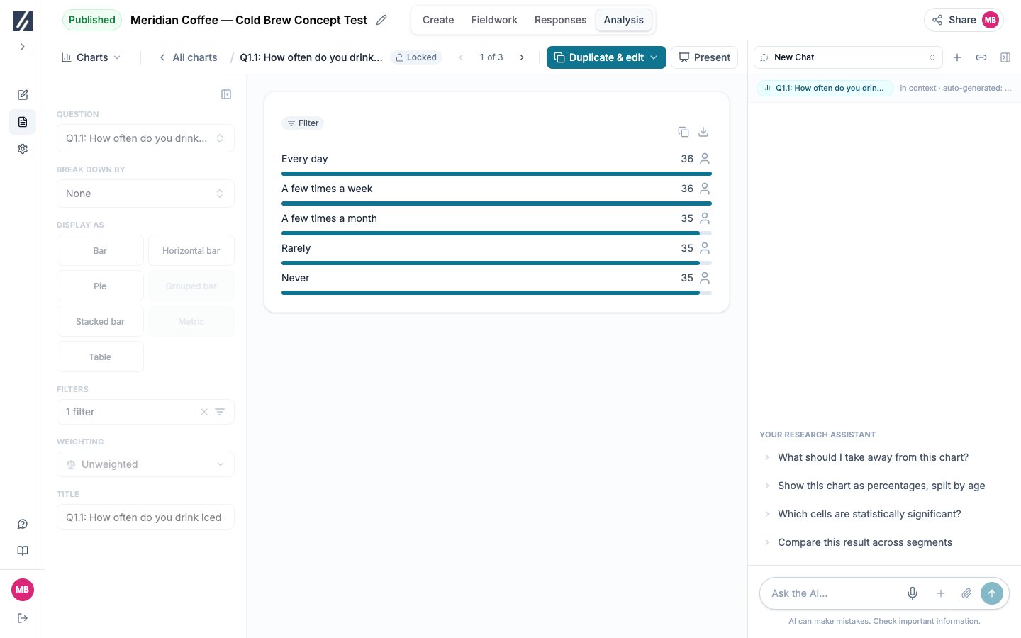
Read the auto-generated chart before saving a copy of it.

Read the auto-generated chart before saving a copy of it.

5

Read each crosstab

Read the raw column base before any percentage. A base below 30 is marked ** and is not tested. Coloured cells compare a column with the row total; letters compare columns with each other at the table’s confidence level.Check: write each difference with both groups, their values, and their raw bases. See Interpret significance.
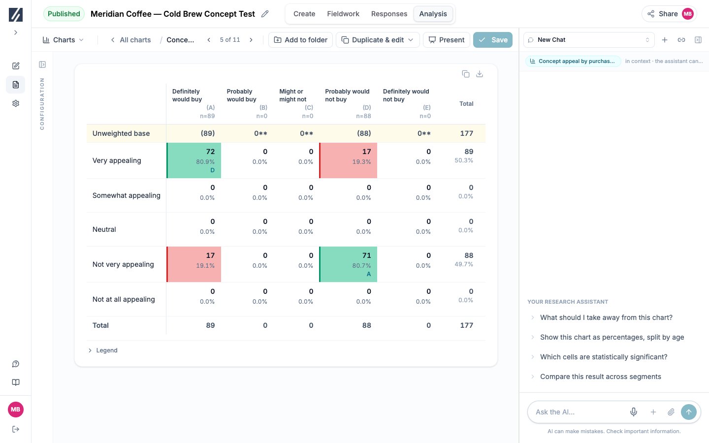
Read raw bases before percentages and significance markers.

Read raw bases before percentages and significance markers.

6

Verify with the assistant

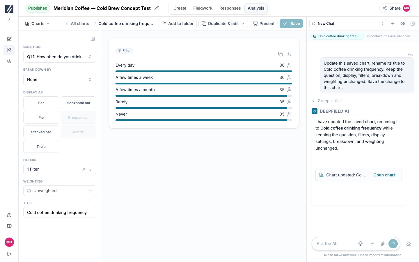
Select Assistant and ask for the answers or quotations behind a result, then open the citations and read the full responses. On a chart you saved yourself, you can ask for a change such as “Show this chart as percentages, split by age”; the assistant saves it and notes “Chart updated” with Open chart.Check: reopen a changed chart and confirm its configuration and base. The assistant does not change plan charts. See Ask questions about your data.
Verify the saved chart from the assistant’s update receipt.

Verify the saved chart from the assistant’s update receipt.

7

Refine a chart

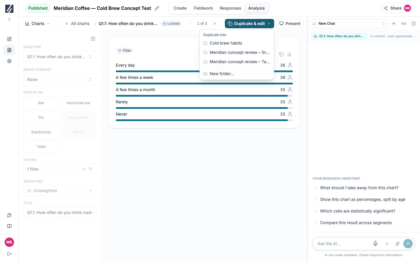
Open a plan chart and change it. The toolbar button turns from Save into Duplicate & save: select it, then pick one of your folders or New folder…. The edited chart is filed there and opens in its place. In the same browser tab, next and previous on the copy continue through the plan folder while its source remains available.Check: the copy sits in the folder you picked, and the plan folder still holds the chart as the plan built it. See Edit a plan chart.
Save an edited plan chart into your story folder.

Save an edited plan chart into your story folder.

8

Assemble your story folder

Use Duplicate & save to keep an edited plan chart in your story folder, or Duplicate & edit in its row’s ⋮ menu to copy it unchanged. For your own saved charts, Add to folder moves the chart into the chosen folder. Save a chart drawn by the assistant by picking its destination and confirming its name. Each chart belongs to one folder; duplicate it for another story.Check: open the first chart from your folder and step through it; the sequence should read as the argument you intend to make.
9

Generate slides from the folder

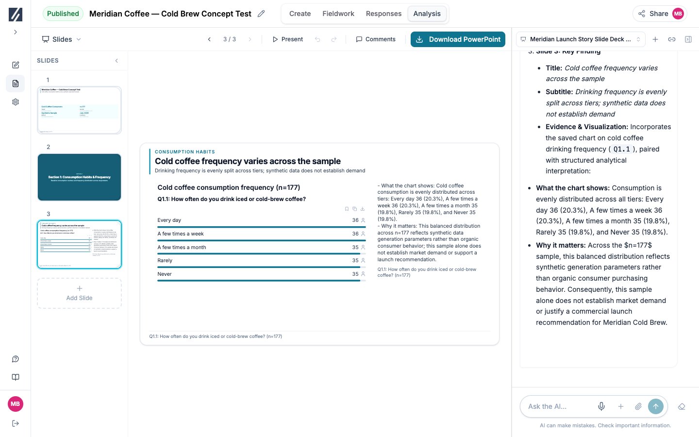
In Charts, open the folder’s ⋮ menu and select Generate slides from this folder. Slides opens with the request visible. Review the Proposed storyline, then select Request changes or Approve & compose.Check: compare every slide’s headline and interpretation with its chart and base. See Build a deck from a folder.
Start the storyline from a folder of checked charts.
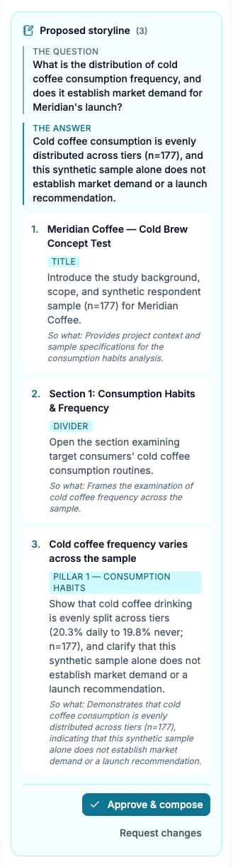
Start the storyline from a folder of checked charts.

Check the storyline’s claims against the chart, then approve or request changes.

Check the storyline’s claims against the chart, then approve or request changes.

10

Export and check

Select Save Changes, then Download PowerPoint. In Charts, select Download Excel for the full tables; the workbook has one sheet per folder you select.Check: open both files and compare one key figure and its base with the source chart. See Export your results.
Check the composed slide against the chart before exporting.

Check the composed slide against the chart before exporting.

Update after new responses

Return to the plan and select Save and regenerate. In the same output language, existing themes are reused and only new open answers are classified. The plan folder is rewritten: unchanged charts keep their place, new outputs are added, and charts the plan no longer produces are removed. Your copies and story folders are not changed, so step through the plan folder again and update your story folder before regenerating slides.

Check the result

Every retained claim has a checked source chart and raw base. The deck was built from a folder you reviewed, its storyline was approved, and the exported files match the charts.