
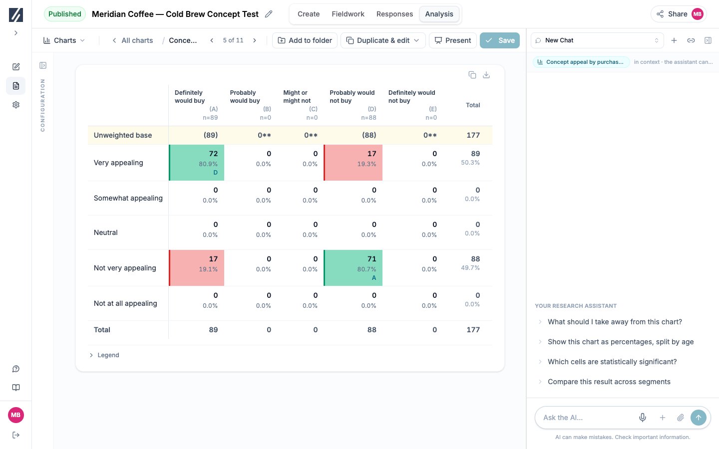
This synthetic crosstab shows raw bases of 89 and 88, with colour and letter markers.
Before you start
Define the row measure and comparison groups. Check that eligible responses exist in the groups you intend to test.Build the table
1
Choose the row variable
Under Question, select the measure whose answers should appear down the table.
2
Select Table
Under Display as, choose Table.
3
Add the first column variable
Under Break down by, choose the segment or question that should form the columns. Column letters and bases appear in the preview.
4
Configure and save
Select the required cells, summary rows, significance settings, title, and weighting, then select Save to charts.
Add or nest columns
Additional breakdowns create independent column groups, each with its own letters and statistical result. With exactly two column variables, Nest the two questions crosses them into combined columns such as region within age. Nesting supports one additional variable. Remove nesting before adding more independent groups.Choose the values shown in cells
Cells controls the stacked values:
Weighted counts can contain decimals because they are weighted sums rather than respondent headcounts.
Add base and summary rows
Additional rows can include unweighted and weighted bases. Numeric row variables can also show mean, standard deviation, median, minimum, and maximum. Multi-select rows can show the mean number of answers. Statistical tests use unweighted bases even when the displayed result is weighted.Read significance markers
The table uses two separate comparisons:
A letter names the column with the lower result. For example, B in column A means A is significantly higher than B at the indicated confidence level. Uppercase represents the primary level; lowercase represents the secondary level.
Open Legend beneath the table whenever a marker needs interpretation. Each independent column group has its own comparisons.
Configure statistical settings
Heatmap and significance-cell coloring both use the cell background, so enabling significance coloring disables the heatmap.
Check the base before reading a marker
A large percentage difference in a column below 30 is not tested. Widen the column definition, group compatible options, or describe the result as directional.
Group or hide categories
Open the gear beside the row or column variable.- Hide removes an option from the table but keeps it available to restore.
- Group selected combines selected options under a new label.
- Keep the detail rows (net) adds a grouped net while retaining its component rows.
- Ungroup returns the options to separate rows or columns.
Generate several crosstabs
Use Bulk generate, choose the crosstab or table output, select the columns and row variables, then choose shared filters, weighting, and destination folder. The selected column order determines the group order in each table. The dialog reports the number of tables before generation. Open-text and unsupported rows are omitted.Troubleshooting
No cells are marked significant
No cells are marked significant
Expand Legend and read the note below the table. The table may have no eligible bases, too few rows or columns, or completed tests with no result at the selected levels.
A column has values but no markers
A column has values but no markers
Check its unweighted base. A base below 30 is shown with
** and is not tested.A variable is missing
A variable is missing
The questionnaire changed after the chart was saved. Reopen the chart, replace the missing variable, and save the current specification.
The crosstab is absent from PowerPoint
The crosstab is absent from PowerPoint
PowerPoint includes a crosstab as an editable table when the crosstab is on a slide of the saved deck you download. A long table continues across several slides, so check the continuation slides. Use the Charts Excel export when you need the complete grid and its statistical lines.